tweetindex
TR

Yohan

@yohaniddawela · Newsletter → · joined 17 Mar 2017

Sharing insights from the intersection of geospatial data science and economics | PhD in Economic Geography from @lsenews. Views are my own.

21 838Followers
243Following
9 117Posts total
2.9MViews on collected posts

Son gönderiler

Car dependency predicts how much a city drives. And the relationship is stronger than most planners assume. A new study from Sony finds that across major cities, the Car Dependency Index lines up closely with real behaviour. The correlation is r = 0.66 (p < 0.01). As dependency
2.4K views · 18 likes · 9 reposts · 0 replies Open on X →
Half the world’s mangrove ecosystems are now at risk of collapse, and rising seas are the main reason. This is the first global Red List of Ecosystems assessment of an entire ecosystem group. Mangroves cover about 150,000 square kilometres of coastline, around 15% of the world’s
1.2K views · 19 likes · 8 reposts · 0 replies Open on X →
Most forest carbon credits did some real conservation work. They just claimed far more than they delivered. A new Nature Communications paper looked at six independent evaluations covering 44 first-generation REDD+ projects. The result is pretty brutal.... Most projects did htt
7.3K views · 51 likes · 11 reposts · 3 replies Open on X →
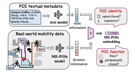
A Google model that had never read a word about a restaurant, and knew only the times people walked in and out, guessed its price bracket better than Gemini did reading the full description. That comes from a new paper by Google Research and the University of Southern https://t.
1.2K views · 12 likes · 2 reposts · 1 replies Open on X →
Interested in getting a short overview of the latest geospatial papers and datasets each week? Subscribe to the Spatial Edge newsletter: https://t.co/pVZ6fGgp4E https://t.co/qCfQSjo3qm
63.4K views · 31 likes · 4 reposts · 0 replies Open on X →
@yohaniddawela The natural outcome is that all available/reasonable paths will converge on basically the same travel time. That would be a sign routing is actually working correctly. I'm honestly a bit surprised we're not already there...I had assumed Google was already doing th 20.8K views · 211 likes · 1 reposts · 3 replies Open on X →
For six months, Google Maps sent a slice of drivers in ten American cities down deliberately slower routes. About 30 seconds slower on average, and under 2% of trips were touched. The experiment ran on roughly 100 of the most congested road segments in each city, switching on ht
1.7M views · 4.7K likes · 404 reposts · 115 replies Open on X →
@yohaniddawela I hate the idea of light pollution being used as a measuring rod for economic growth. It is like measuring plastic or other pollution. If and when light pollution is taken seriously the world will be darker at night and Astronomers, pro and amateur, will have more 471 views · 8 likes · 0 reposts · 0 replies Open on X →
@coschoolofmines @EU_Eurostat If you’re wondering whether there are other ways to estimate wealth using geospatial data, then check this out: 15.2K views · 100 likes · 5 reposts · 6 replies Open on X →
@coschoolofmines @EU_Eurostat If you enjoyed this thread give us a follow @yohaniddawela for more breakdowns on geospatial topics. 19.7K views · 72 likes · 2 reposts · 1 replies Open on X →
@coschoolofmines @EU_Eurostat The takeaway: Using luminosity (from VIIRS) as a proxy for GDP will become increasingly problematic as more cities introduce LED lighting. We therefore need satellites with wider spectral bands—to capture the light emissions from LEDs. #gischat 17K views · 170 likes · 14 reposts · 6 replies Open on X →
@coschoolofmines @EU_Eurostat This is a problem: 1. More cities will introduce LED lighting 2. VIIRS nightlight images can't capture this lighting 3. It will inaccurately state that luminosity has decreased 15.1K views · 97 likes · 4 reposts · 1 replies Open on X →
@coschoolofmines However, if we look at official GDP data for Milan from @EU_Eurostat, we can see that GDP increased significantly from 2013 to 2016: https://t.co/vYsprwSrqy
16.3K views · 83 likes · 1 reposts · 1 replies Open on X →
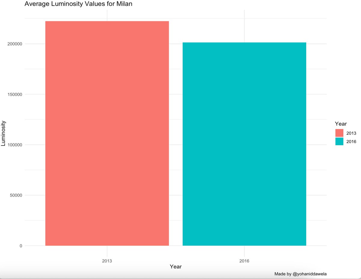
@coschoolofmines Or if we aggregate all luminous pixels in Milan in 2013 and 2016, we can see this effect more clearly: https://t.co/2SQMVwTsj1
17.6K views · 71 likes · 3 reposts · 2 replies Open on X →
However, when we compare VIIRS night time satellite imagery (provided by @coschoolofmines) in 2013 (top panel) and 2016 (bottom panel), it appears as if Milan's luminosity decreased. You can see less white and red spots in these images. https://t.co/7gssA8e8Pz
20.2K views · 107 likes · 4 reposts · 2 replies Open on X →
In 2015, Milan introduced a policy to convert its street lighting to LEDs. https://t.co/0UpNT0Vi9Q
22.2K views · 86 likes · 2 reposts · 1 replies Open on X →
This means that as cities introduce policies to change outdoor lighting to energy-efficient LEDs, VIIRS satellites will mistake this for a reduction in luminosity. In fact, this is exactly what happened with Milan in 2015. 22.7K views · 138 likes · 9 reposts · 1 replies Open on X →
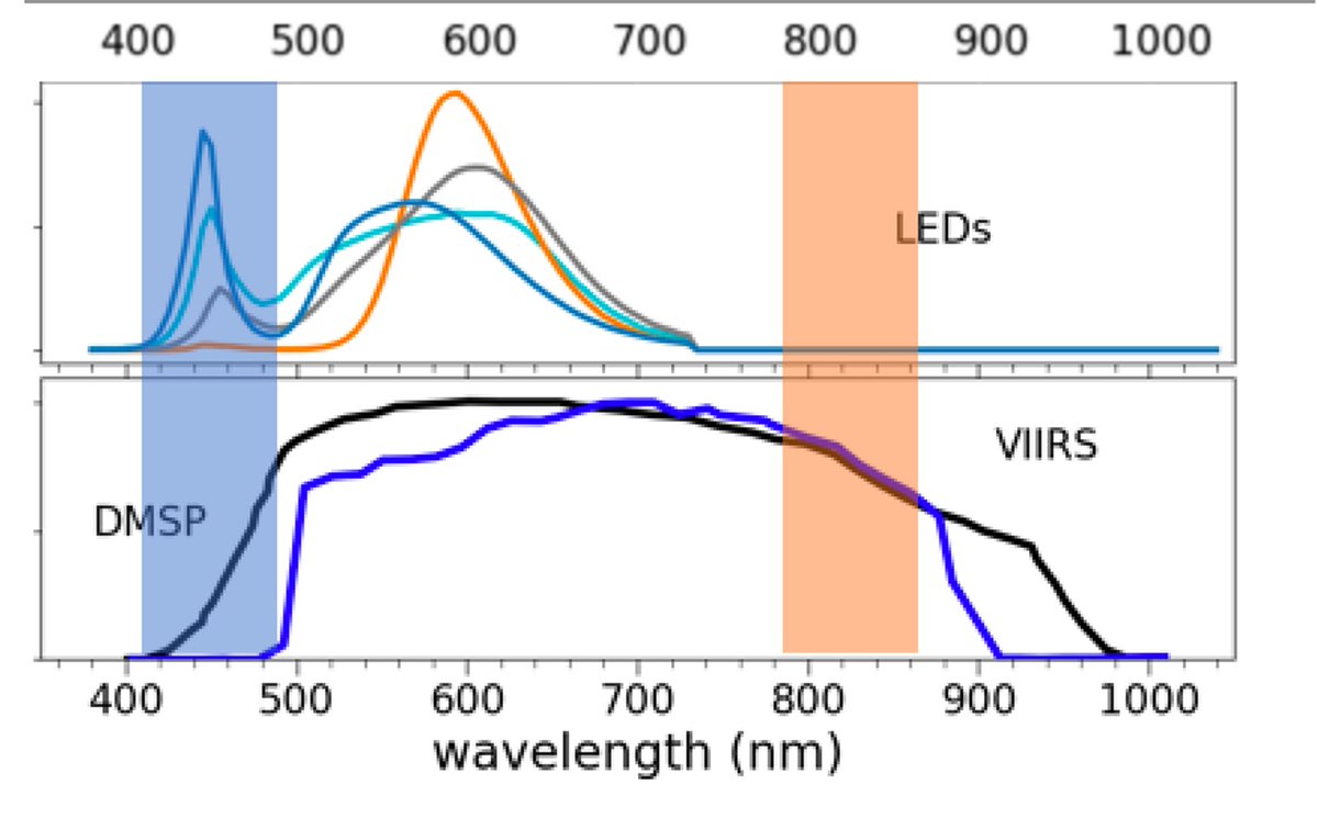
VIIRS satellites can't capture 'blue light' emissions from LED lights. In the below graph: • the blue rectangle = the blue light spectrum • LEDs (blue line in the top panel) emits a lot of blue light • VIIRS data (blue line in the bottom panel) can't capture any of this https:/
27.1K views · 124 likes · 11 reposts · 2 replies Open on X →
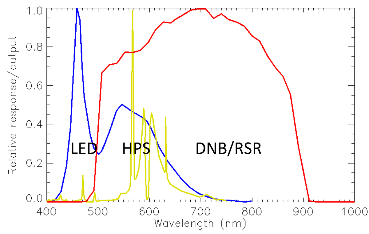
In the below graph, we can see that: • LEDs (blue line) has shorter wavelengths, • High Pressure Sodium (HPS) lights (yellow line) has much longer wavelengths HPS lights are commonly used in outdoor lighting. https://t.co/2XoAXDEER8
29.7K views · 121 likes · 4 reposts · 2 replies Open on X →
I have previously provided an in-depth overview of the strengths/limitations of the various forms of nightlights data here: 48.3K views · 108 likes · 5 reposts · 1 replies Open on X →
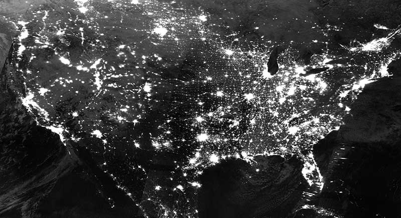
Soon we won't be able to use nightlights as a proxy for economic growth. Why? It's due to limitations of its spectral bands. Here's the breakdown in simple terms: https://t.co/b32N5yRDCI
668.9K views · 2.1K likes · 403 reposts · 39 replies Open on X →
Did you know we can measure household wealth using daytime satellite images? How does this work? Here’s the breakdown: The original research came from @nealjean1 at @StanfordAILab. They created a novel way of using machine learning to predict household income using daytime ht
55.6K views · 120 likes · 24 reposts · 1 replies Open on X →
Night time satellite data is one of the most promising proxies for economic growth. • How does it work? • How accurate is it? • What are its issues? Having worked on this extensively during my PhD and after, here’s everything you need to know: https://t.co/mxvjWBOaRq
GIF
77K views · 128 likes · 28 reposts · 1 replies Open on X →

Aynı büyüklükteki hesaplara karşı

Son 90 güne ait 7 gönderi, 10K–100K takipçi aralığıyla yan yana. geniş kitleye gösteriliyor, ama izleyenlerin azı tepki veriyor.

Medyan görüntülenme7 312bu hesap1 03310K–100K için medyan
Erişim, %33.48%bu hesap3.60%10K–100K için medyan
Etkileşim, %1.03%bu hesap1.69%10K–100K için medyan
ÖlçütBu hesap10K–100K için medyanOran
Gönderi başına medyan görüntülenme7 3121 0337.08×
Erişim (görüntülenme ÷ takipçi)33.48%3.60%9.30×
Etkileşim oranı1.03%1.69%0.61×

Bu aralıktaki diğer hesaplar →   Başka bir hesapla karşılaştır →   Bu kıyas değerleri nasıl kuruluyor →

Growth & engagement

How the posts we collected actually performed: views and reaction rate post by post, what the audience did with them, and where the follower count goes.

Views per post

17.6K23 Nov
16.3K
15.1K
17K
19.7K
15.2K
47125 Nov
1.7M28 Aug
20.8K
63.4K
1.2K5 Sep
7.3K6 Sep
1.2K7 Sep
2.4K8 Sep

Last 14 collected posts, oldest on the left. The scale is logarithmic: one post can outrun the rest a hundred times over.

Engagement rate per post

0.43%23 Nov
0.52%
0.68%
1.13%
0.38%
0.73%
1.70%25 Nov
0.31%28 Aug
1.03%
0.06%
1.27%5 Sep
0.89%6 Sep
2.21%7 Sep
1.11%8 Sep

Reactions — likes, reposts, replies and quotes — divided by views. Median for 10K–100K accounts is 1.69%.

What the audience does

Likes63.7%8 640 in total
Reposts7.1%958 in total
Replies1.4%189 in total
Quotes1.6%217 in total
Bookmarks26.2%3 549 in total

Share of every reaction we collected for this account. Replies mean argument, reposts mean endorsement, bookmarks mean the post was worth keeping.

The follower curve appears once this account has two daily snapshots — we take one a day, and this one is on its first.

Benzer hesaplar